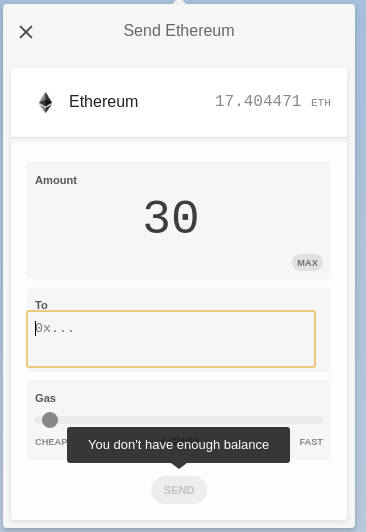
Place error labels on top of the problematic field
When mistyping a too big amount compared to the balance or a wrong address, the error only shows on mouse hover the grayed "send" button. It should appear automatically either on defocus of the field or when clicking on send.
Additionally, when no password is entered and "send tx" is clicked there is no feedback
