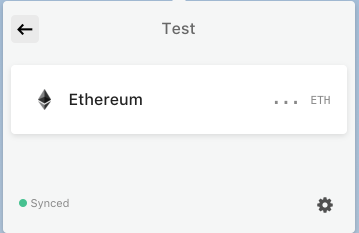
Account view
Personally, I think I'd prefer if the identicon was shown in the 'top bar' next to the account name if you can make that work with the current design.

The information provided in the following view seems fairly redundant. It shows both the acc name and address twice. Furthermore, instead of having a dedicated 'copy address to clipboard'-button, this functionality could be provided through a click on the text box plus a dialog that states that the address was copied to the clipboard.
